Now, Xiaomi has introduced a rather subtle but effective change in its apps: different logos in the headers of its homegrown applications. That simply means Xiaomi is progressively becoming more concerned with branding and visual identity across its ecosystem.
What’s New in Xiaomi Apps?
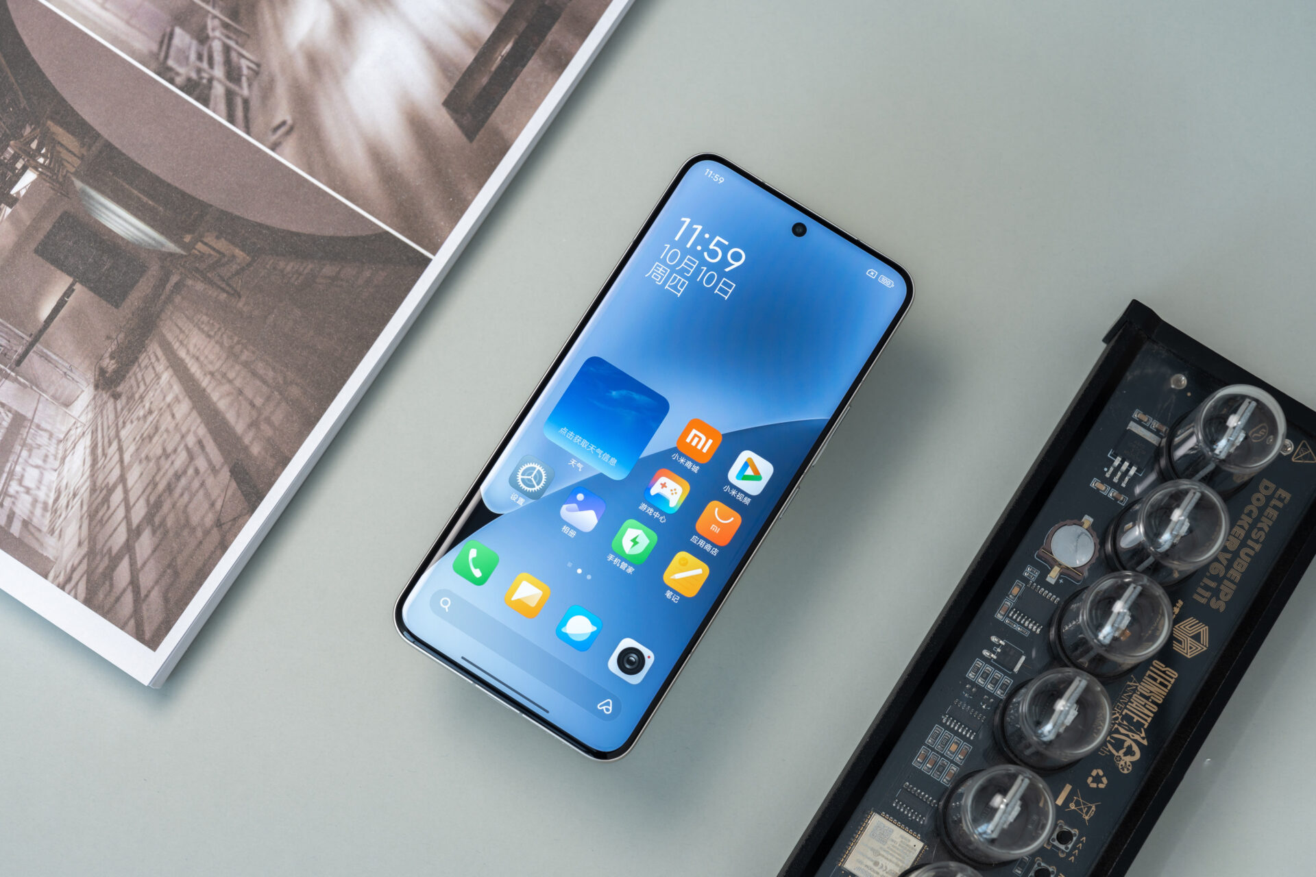
In its latest updates, Xiaomi has integrated app-specific logos into the headers of its core applications. Example:
- Mi Home: Has the Mijia logo above, right at the centre of the header.
- Xiaomi Mall: Includes the highly recognizable Xiaomi logo, further establishing brand identity.
- Mi Video: Has introduced a custom-designed Mi Video icon, which is in harmony with the purpose of the application.
Not only that, this design modification is not for cosmetic change; it’s aimed at the consistency of Xiaomi across all user touchpoints in the brand experience.
Why Is Xiaomi Focusing on Logos?
Logos are not mere signs and symbols; they constitute identity and values of brands. Embedding logos right within the headers of an app, Xiaomi serves many purposes:
- Improved Brand Recognition: Be it Mijia for smart home products or Mi Video for entertainment, these logos instantly remind users about Xiaomi’s ecosystem.
- Improved User Navigation: Logos serve as pointers; therefore, each time a user seeks to access any app, it becomes way easier to locate them.
- Unified Ecosystem Identity: With the expansion in portfolio by Xiaomi-from smartphones to IoT devices-the consistent visual language maintains its ecosystem in a cohesive fashion.
Xiaomi’s Growing Emphasis on Design
This move comes as part of Xiaomi’s broader push toward design excellence. In recent years, Xiaomi has been doing quite a bit to refine its UI and product design:
- HyperOS 2.0/2.1 Updates: Reworked interfaces, smoother animations, and increased visual coherence.
- Product Aesthetics: From smartphones to electric vehicles like the Xiaomi YU7, Xiaomi has come up with a design philosophy around minimalism and elegance.
- Brand Evolution: This has introduced the “Alive” logo design, meaning the shift of Xiaomi toward modern and dynamic branding in recent years.
User’s Response to the Change
Initial reactions among users have largely been positive, with quite a number appreciating how sleek and professional the logo makes Xiaomi’s apps appear. The updated headers pull off a more polished appearance and instill a semblance of brand pride among their fans.
What’s Next for Xiaomi?
That’s a clear indication from Xiaomi that similar changes could be rolled out across more apps and services in the near future. And, considering the company is expanding globally, this consistent branding strategy will be important to make Xiaomi strong in competitive markets.
Adoption of different logos for different apps at the header is one important, yet small step in being a global technology leader, which Xiaomi has done. The company pays attention to every minute detail, like positioning logos, to underline that the user experience is seamless and similar across its ecosystem. Whether you are managing smart devices in Mi Home or shopping in Xiaomi Mall, the new headers make sure you’re connected with Xiaomi’s ever-growing family of products. This strategic step not only enhances usability but also reinforces the brand presence of Xiaomi in the highly competitive industry.


HyperOS Downloader
Easily check if your phone is eligible for HyperOS 2.0 update!


